
Photo Editing Workflow Guide
I remember when I first started editing, I would jump from one section to the next, pulling levers, adjusting colour, and applying masks like crazy. Most of this time was spent grinding away, seeing what sticks with trial and error. I tried using presets to help me understand how photographers made their edits; however, this was the equivalent of taking apart a watch… you open it up, see all the pieces, but don’t get an explanation of why the parts exist in a particular configuration. Once I invested time into learning from photographers workflows, how they edited and read books explaining the editing process, that trial and error started to work because I had a track to follow.
Over time, I started to follow a process. Applying a workflow to every photo, no matter what camera the raw file came from. This has its benefits as your style develops, leading to consistent results between each photo.
So here is my workflow that I implement on every one of my shots in Adobe Lightroom. I’ve arranged them as steps to make them easier to follow.
1: Geometry
No matter how straight you think you got the shot, it’s always good to check if vertical or diagonal lines are actually straight. Using the straighten tool is usually enough for landscapes because the horizon can be an easy line to follow. For street photography or architecture, using the Geometry tool to align verticals is also a big help.
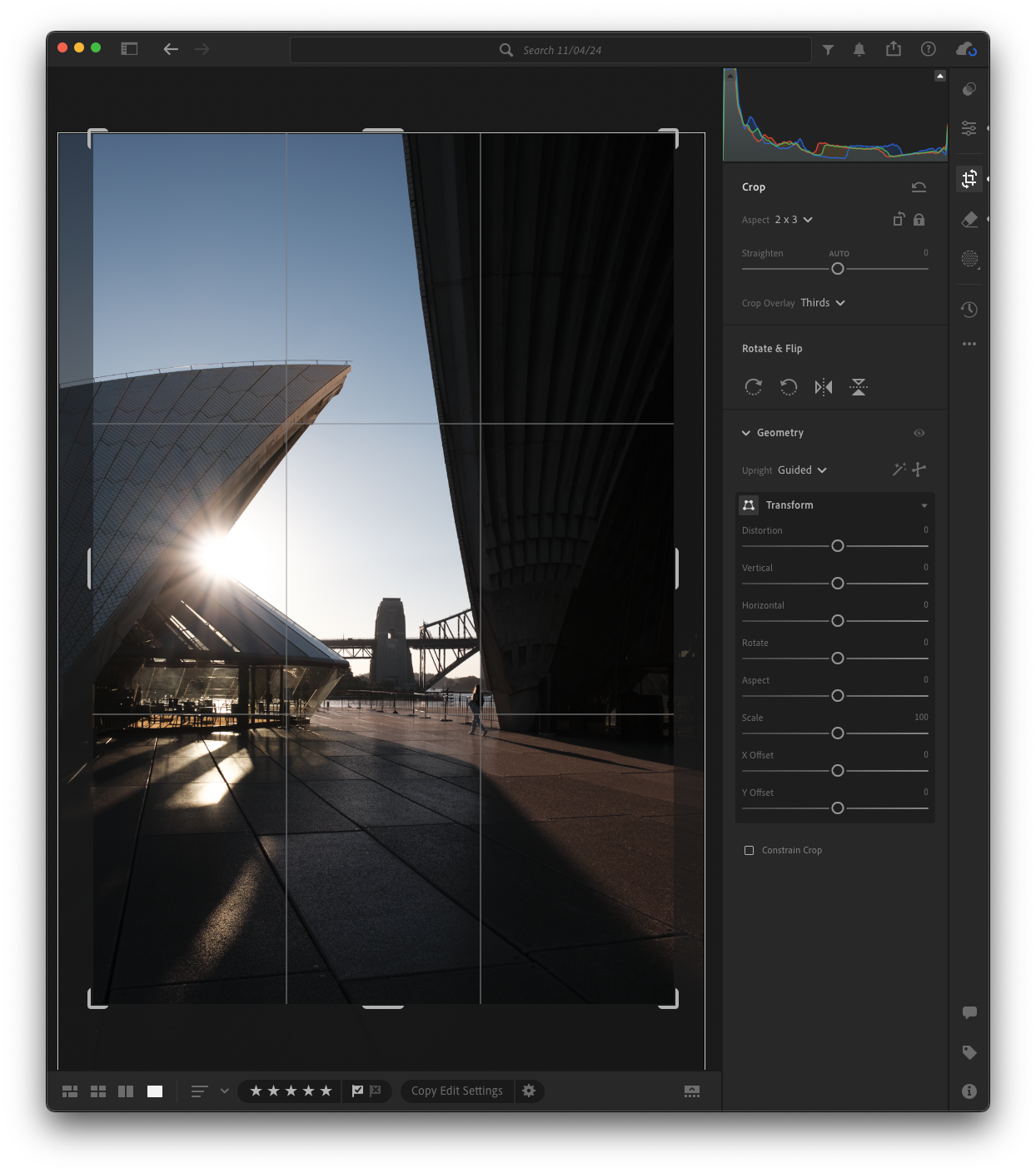
2: Crop
Cropping can be adjusted later on, but I like having the core composition locked in at the start as I’ll be using targeted editing tools to enhance the composition later. When you have the crop tool engaged, it will show the rule of thirds grid. This is the most common composition technique, but if you press the O key, Lightroom will cycle between the other types. In this situation, I have placed the subject along an intersecting line, as all the shadows and the side of the opera house both point at the subject. This needed slight adjusting in the edit.

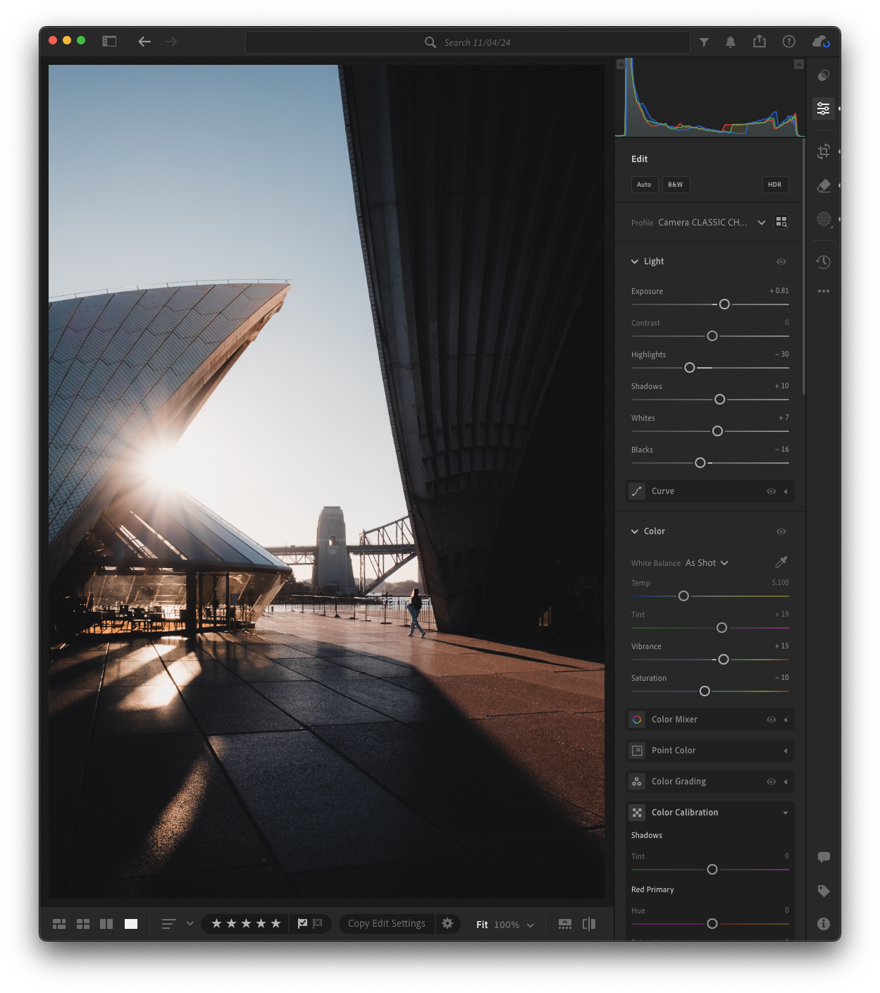
White Balance
I make it a rule to sort out the baseline white balance at the start of the edit. If you decide to warm up your image later, you might conflict with any colour correction, causing the look of the image to fall apart.
In modern-day cameras, if you shoot with auto white balance, then a correction is usually not needed. If you find your shot is leaning too heavily in one direction, too blue or orange, a easy method to correct is using the dropper tool. You want to use it to select a spot that you know is pure white or gray. In this case, I would use the very edge of the horizon.

3: Exposure
Once I have the colour temperature the way I want, I’ll need to make sure the image is exposed properly. You might have heard the term "keeping your histogram in the middle"; this is a good guide when you are starting out. The global exposure needs to be a baseline exposure to allow you to apply targeted adjustments later. If you have to adjust global exposure after a bunch of masks have been applied, it will cause you to have to chase your tail to get the correct exposure again. I generally overexpose in this early part, as it gives me the most room to pull things down with masks and targeted adjustments.
The Profile section in Lightroom allows you to apply a predefined colour and tone to the image. Think of it like a starting point. Most cameras will bring in a basic profile titled Adobe Color, Landscape, Vivid, and more. If you use a Fujifilm camera, then this will display as the Film Simulation you used taking the shot. I tend to use the flattest profile, which is Adobe Color, and generally keeps things consistent between camera brands. At the time of writing this, I have been experimenting with starting with the Classic Chrome film simulation on my Fuji shots. It seems to be a cool desaturated look which fits my general style.

4: Details & Effects
Again, we are trying to get the baseline image set, and the Detail section allows you to sharpen the image. The trap a photographer can fall into with sharpness is trying to sharpen the whole image. I never do this; instead, I’ll usually leave the default and apply the sharpen to just the edges of the image. If you hold the Option (Mac) or Alt (Windows) key while moving the masking slider, Lightroom will show you what edges are receiving the sharpen. I generally never go over a +80 mask.
In the Effects section, I’ll drop the clarity no more than -20 points. I find modern-day cameras and lenses render images so good that knocking them down a bit helps to stop things from looking so clinical.

5: Tone Curve
Now that the baseline is sorted, I’ll move to the creative adjustments. The tone curve allows for targeted adjustments to specific tonal ranges. As an example, if you want bright highlights but deep shadows, the tone curve will let you do that. Think of it like a precision tool for contrast.
This will change from image to image, but I find lowering the shadows, increasing the midtones, and highlights, forming an S curve, adds a good level of contrast throughout the image. I like adding a cinematic fade to a lot of my shots; this is done by lifting the endpoint of the blacks and dropping the endpoint of the whites. This makes the blacks slightly gray and whites off-white. This gives the image a matte look and is more of a stylistic choice.

6: Color HSL
Once I have the contrast sorted, I will do very minor targeted adjustments to the hue, saturation, and luminance of each of the colours. This is when you can start developing your style. I try to keep my interaction with this section minimal as I prefer a more subtle colour palette.
I generally like to shift the hue of reds into the orange side, drop the greens into the yellow end, and tend to keep the blues mostly untouched. On a golden hour photo like this, I like to bump up the saturation on warm colours and lower cooler colours. Luminance is something I generally do not touch.

7: Color Grade
I don’t always use the with the colour grade section. It is a powerful tool that can be pushed in a way that makes the image look unrealistic and over the top. If that’s what you want, go for it; there is no right or wrong way to edit.
The way I have learned to use the grading tool is to add subtle colour saturation into the respective tones. The further you push into a specific colour, the higher the saturation in that colour range.
A good realistic grade generally stays within this colour range in each tone: Highlights stay within Orange or Cyan, Midtones in Yellow or Green and Shadows look good in Red or Blue.
In this case, I have added a slight blue grade into the shadows to contrast the golden light, to which I added some orange into the highlights to enhance the scene.

8: Repairs and Touchups
This is where I will look for things in the image that distract. A common thing that comes up, is dust spots from particles either on the lens or image sensor. The heal brush is good for this. The clone tool is good for distractions like pieces of rubbish or random spots from the environment.
In recent versions, Lightroom has introduced the remove tool which uses AI tech. This, of course, is a personal decision if you are going to use it. What I see this used for a lot is removing big items like a whole person from an image. Use at your discretion; at this point, Lightroom is using AI tech to generate pixels and adding things that were never there.
9: Masking
This will really depend on the image, but I will use masking to apply target exposure, effects, and colour adjustments. You might want to use a Linear Gradient to add darkness from an edge of a frame to softly drop off towards your subject. Or use a Radial Gradient to enhance a light source. The possibilities are endless and too many options to even try to squeeze into a few paragraphs.


10: Fine Tune
This is when I make the final adjustments to the overall exposure and global colours. The final look of the image will take shape here. I’ll fix up the highlights, usually dropping them down a bit or raising the shadows.
At this point, I’ll raise the vibrance to my liking. This will intensify any colours that are muted but won't impact the already highly saturated colours.
In a lot of cases, I will lower the global saturation if I find a mix of the HSL and final exposure adjustments have lifted colours to a higher place than I would like them to be.
I want to put in a nugget of advice here: never touch your global saturation slider at the beginning of a edit, especially raising it. It is something that can cause your image to really fall apart once you start stacking HSL and colour grades over the top. I find it better to use as a dial-down tool to adjust the changes I have made. This can also be applied to the global contrast slider to help dial down tonal effects.
11: Sleep on It
At this point, you have been staring at your screen for a while, focused on the edit, and probably got tunnel vision. It’s easy to miss things that may be pretty obvious after you come back. Go rest, preferably sleep on it. When you come back, your eyes will see things from a fresh perspective. I actually like to export the image and look at it on a new screen like my mobile. It will help to view it from an even fresher perspective.
12: Finish Up
Once I’ve returned I’ll adjust things depending what I found. It’s amazing how many things I’ve noticed after resting from the edit. Really obvious stuff like over saturated images or a big dust spot in a really stand out area.
Sage Wisdom
A piece of advice I hear all the time from other photographers. Is keep the edit simple, don’t over do it. Despite hearing this advice, I understood the words but missed the true meaning. This is something I needed to learn on my own. I have found following this photo editing process order keeps me in check from overdoing an edit.
In photo editing, less is more.